Quality guidelines
Please open an issue using the Quality Guidelines template for support regarding these guidelines.
The following guidelines are not required for submission to Flathub, but are best practices we recommend and consider for curation and promotion. These guidelines are designed to help your app and Flathub itself appear in the best light to users. The guidelines may change over time based on developer and user feedback.
The term must in these guidelines is used in the context of considering
whether an app passes the app listing quality checks. Apps that do not
follow these guidelines may still be published on Flathub.
For the basics on how to write metadata for your app, see the MetaInfo Guidelines.
Benefits of passing quality checks
Passing the quality checks enhances an application's visibility on the Flathub homepage. Applications that meet all the checks can be featured prominently on the weekly banner and "App of the Day" highlights on a rotational basis. The more guidelines an application meets, the higher its chances of being featured in the trending section of flathub.org. Additionally, some Linux distributions and software centres may use the list of approved apps to curate their own featured selections.
These benefits may evolve as we explore new ways for enhanced curation and promotion.
General
No trademark violations
Please see the policy in the requirements section.
Runtime not end-of-life
Your app must target a runtime that is not end-of-life (EOL). This means you should not use deprecated or obsolete runtimes, as they may not receive security updates or support.
Check Runtimes for runtime support periods and expected eol dates.
Managed by app author
Use Flathub verification to indicate that you are the author of the app and that you are managing the app on Flathub.
Brand colors
Has primary brand colors
Apps should set two primary brand colors,
light and dark.
For example:
<branding>
  <color type="primary" scheme_preference="light">#faa298</color>
  <color type="primary" scheme_preference="dark">#7f2c22</color>
</branding>
Good brand colors

Brand colors are often used as a background behind the app icon, so make sure the colors are not too similar to the app icon in order to ensure good contrast. Avoid using light colors for the dark variant, or the same color for both dark and light. In most cases the dark variant should be a darker, more muted version of the light brand color. Do not use the same color for the dark and light variants.
Brand colors should be colorful. In particular, avoid white (or very light grays) and black (or very dark grays).
When choosing brand colors, a good starting point is using a lighter/darker version of the primary color used in the icon (though be careful to maintain good contrast with the icon), or a complementary color that pairs well with the main icon color (e.g. blue if the icon is yellow).
It's recommended to consider the brand colors an extension of the app icon, and have the icon designer choose them when making the icon.
Feel free to play with our banner preview to find your favorite colors.
App Icon
Icon size
The icon should be SVG, or a PNG with a size greater or equal to 256x256 pixels. It has to be square.
Reasonable footprint
The icon shouldn't fill too much or too little of the canvas. Avoid filling the entire canvas and having the icon touch the edges of the canvas (except with small protruding elements). Similarly, avoid thin shapes that are hard to see.
You can use our icon grid (SVG template download) with square and circular base shapes to check if your icon's footprint is too large or too small. The examples below show the grid overlaid on some app icons. The first icon fills too much of the icon grid and extends beyond the grid and the second icon fills too little of the icon grid due to the transparency, so they don't pass this guideline.
Good contrast
The icon should have good contrast on dark and light backgrounds. In particular, avoid single-color glyphs and the like since they can be very hard to see if the background color is similar. Dark colors near the edges are also a problem since shadows don't help much with contrast on dark backgrounds.
Not too much or too little detail
The icon should be recognizable in small sizes. Avoid too many tiny details and small text, and generally try and match other well-executed app icons in terms of complexity. Icons should also be complex enough to be recognizable, e.g. a flat single-colored symbol is too simple.
No baked-in shadows
The icon should not have any baked-in shadows or glows. Both the Flathub website and native stores apply a shadow to all icons, so baked-in shadows result in double shadows or other glitches.
In line with contemporary styles
The icon should be somewhat in line with the contemporary icon styles (i.e. not look like it hasn't been updated in decades). The GNOME and KDE app icon guidelines are examples of the kind of style your icon should align with.
In some cases, it can make sense for the icon to align with the visuals of the app, rather than contemporary icon styles (especially relevant for games). This can be accommodated by embedding the custom style icon in one of the grid shapes, e.g. a square or circle. This way the unique style is preserved, but the icon's size and shape are in line with other apps.
App Name
Not too long
The name should ideally, be no longer than 15 characters, and must be shorter than 20 characters.
- Apostrophe Markdown
- Minimal Markdown Editor
Just the name
The name should be just a short name, without any additional information. For example, don't append what the app does or is used for to the name; use the summary to provide this information instead.
- Krita - Digital Painting, Creative Freedom
- Fractal (Matrix Client)
- Apostrophe: the best free Markdown editor
- Firefox Web Browser
- Krita
- Fractal
- Apostrophe
- Firefox
If the app is distinct among different versions of your app on Flathub
(e.g. Firefox Beta versus the standard Firefox), then using the full
name including the edition may be acceptable.
No weird formatting
App names should avoid nonstandard formatting and punctuation. For example, avoid all-lowercase, all-uppercase, camel/pascal case, and punctuation like dashes or periods.
- krita
- FRACTAL
- ApostropheEditor
- Firefox.org
Cases where the formatting is part of an established brand may be
exempt (e.g. VLC).
Summary
Not too long
The summary should ideally be between 10 and 25 characters, and no longer than 35 characters.
- Write markdown in style
- Simple, easy-to-use, distraction-free markdown editor written in Python
Not technical
The summary should be understandable by a non-technical person, and not contain any technical terms. Don't mention the toolkit, programming language, or other implementation details that would not be relevant to a non-developer and explain what the app does for people instead. Don't duplicate metadata that's already available in a different form, such as the license, e.g. by mentioning that the app is "free and open source". Avoid generic nouns like "app", "tool", or "client".
- GTK4 chat app written in Rust
- An Electron Wrapper for the Telegram Web App
- Free and open source Qt5 Matrix client
There are separate fields for technical information. If you want to mention the toolkit do it in keywords.
No weird formatting
The summary should not have any weird formatting or punctuation. It should use sentence case, rather than title case. It shouldn't end with a full stop.
- A Simple Markdown Editor.
Don't repeat the name
The summary is usually shown next to the app name, so repeating the name looks bad.
- Apostrophe - A simple markdown editor
Don't start with an article
Starting summaries with an article is almost always unnecessary. Instead, either omit the article or ideally phrase it in the imperative with a verb.
- An image viewer
- The LibreOffice suite
- View images and videos
- Edit documents
Description
Don't repeat the summary
The description should not just repeat or rephrase the summary. The summary is a kind of slogan or advertisement for the app, while the description should go into more detail about the purpose of the app, which features it has, and what makes it unique.
Not too short
The description should be substantially longer than the summary. Something like 3-6 lines of text at default line widths (around 70 characters) is a good length for most apps, for very large apps up to about 10 lines.
No super long lists
Avoid feature lists with more than 10 items, they are difficult to scan and make the app store listing unwieldy. Instead, try to group points or use paragraphs instead of bullet points.
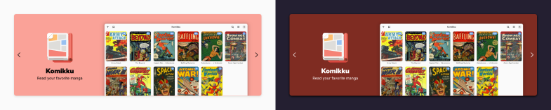
Screenshots
At least one screenshot
Apps should have at least one screenshot in English. For medium-complexity apps, 3-6 is a good range, for very large apps with lots of screens 6-10 is appropriate. More than 10 is probably too many.
Your best screenshot should be in the first position because it will be the first thing a user sees when viewing your app on Flathub.
We might also use this in other places, such as featured banners, so make sure it's a good one.
Tag screenshots with the correct language
Screenshots should be tagged with the language
they are in. For example, if you have a screenshot of the app in German,
tag it with xml:lang="de".
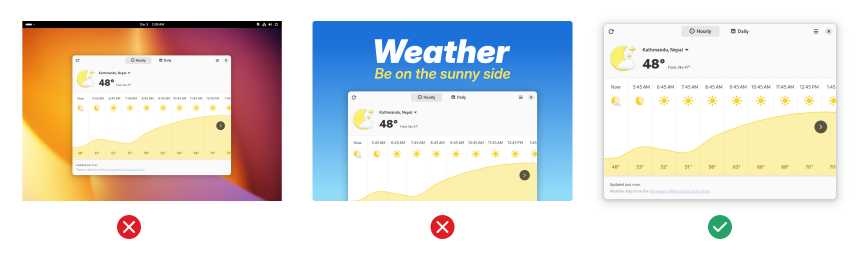
Just the app window
Use the "window screenshot" feature in your native system screenshot tool to get just the app window and its shadow. Do not include the wallpaper behind the app or even the entire desktop. Do not edit the screenshot, crop it, add text, or include promotional graphics.
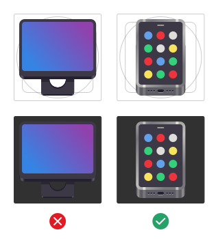
Take screenshots on Linux
Do not use screenshots taken on other platforms, especially if it's immediately obvious from window controls and the like.
Default settings
Use the platform default configuration for all settings that affect screenshots, including window controls, interface font, large text, high contrast, dark style, accent color, and so on. Having some screenshots to show off that e.g. dark style is supported is fine, but these should not be the only screenshots.

Include window shadow and rounded corners
Screenshots must include the native decoration such as any title bar, window shadows, and rounded corners. App stores do not add a shadow after the fact, and without one, screenshots can look glitchy or have low contrast depending on the background. Apps that are always fullscreen (such as most games) are exempt from this, but in these cases, all screenshots must be fullscreen. Do not use a mix of windowed and fullscreen screenshots.
Don't maximize your app window when taking screenshots, since this will remove the shadow and rounding.
Reasonable window size
In order to ensure that text and interface elements are visible scaled down in the app store UI the window size should be 1000x700 pixels or smaller (2000x1400 for HiDPI).

Image captions
Every screenshot should have a caption briefly describing it. Captions should only be one sentence and not end with a full stop. Don't start them with a number.
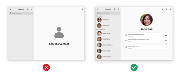
Good content
Screenshots of apps that display content (media viewers, notes apps, chat, social media, and the like) should not show empty states or ugly content. Take some time to select high-quality content, it makes all the difference for screenshots.
Up to date
Screenshots should reflect the current state of the app's interface, not some previous version. If an app update makes visible changes to the interface, screenshots should be updated at the same time.
This also applies to changes in the environment's default window decoration layout.
Release Notes
Release notes for every release
Make sure all your releases have release notes, even minor ones.
Short but informative
Release notes should not be too long, and focus on briefly explaining what changed from a user perspective. 2-3 sentences for medium-sized releases is a good length. For larger releases, avoid endless bullet point lists and rather go with a few paragraphs or a shorter summarized list instead.
No "bug fixes and performance improvements"
Release notes should include some actual information about what changed rather than just a generic boilerplate.
Age Ratings
Take easily accessible content into account
Apps acting as "readers" or "stores" for external content should take into account what is accessible by just navigating around in the app. If content of a certain type can be arrived at without searching or typing in URLs, the app should be tagged as containing it. For example, an RSS reader that doesn't feature any content can be "All Ages", but the rating for a manga app with pre-configured servers should reflect the content of those default sources.
Please see the MetaInfo guidelines on how to generate proper age ratings.